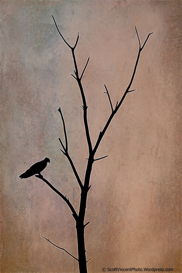
The Lone Osprey. So many things to learn from this image. Photographers, when seeing an opportunity to photograph a bird, will generally attempt to inch closer and closer in order to obtain a more frame-filling image. A frame-filling image can be beautiful and I’ve taken many of them, but they can be less artistic and less creative than an image where the bird is small in the frame simply because there is more to work with when you have a subject small in the frame in terms of placement, what you decide to include or exclude, etc.
However, because of all of the possible options, it is much more challenging to make an artistically pleasing photo of a bird which is small in the image, but in my view it is very worth it to try. When done right, these images can be highly memorable and impactful.
When I saw this Osprey land in a dead tree, I looked immediately to see what opportunities there may be to make a pleasing image. The tendency is to get closer – instead, I walk away. How far? I walked away until the tree was fully visible in the whole frame. A much more impactful image resulted in my view.
But getting a great image is only half the battle. How do you present it? In this case, I wanted to enhance the artistic impact by enhancing the silhouette effect by adjusting levels and curves. Then the image was run through the Fractalius processing software where I selected options to create a small white boarder around the silhouette to make it stand out a bit more. Lastly, a texture overlay was added to the background to complete the effect.
I’m liking it!! How about you??


It’s terrific. But I’d like to know how you achieved the backgrouns, or lack thereof. It’s as if there was nothing in the background at all.
Thanks so much Nancylee! I really appreciate that. The original background was an average sunset, so the photo was a silhouette to begin with and didn’t really have a background as such. I replaced the sunset with a “texture” image by adding it in as a layer and merging it with the Overlay blend mode. That effectively replaced the plain sunset sky behind the tree. I hope that helps. Thanks for stopping by!
Nice work Scott, I love the texture color tones.
Nice work Scott, I love the texture color tones.
I like many things about what you created, here. Including much of the tree was certainly the way to go. Especially with the shape of that tree and the curve of the upper right branch leading back to the osprey. Your use of Fractalius was right on, as well. Instead of using it as end in itself, like some like to do, you employed it as a tool to achieve a specific effect you wanted — one that works very well. The texture you used is great for this image. It’s vertical, it’s interesting without being distracting, the bluish gray helps to draw attention to the bird, and the lighter brown on the right nicely echoes the shape of the tree.
Yes, I think I’m liking it, too.
Thanks so much Dennis! And thanks for your very thoughtful feedback – really very much appreciated. As you well know, there’s a bunch of little details that make up a photo. It doesn’t always come together, and I’m glad it seemed to with this one. Thanks for stopping by!!