I’m never really sure what I’m going to come back with from New York City from an ad hoc shoot – It’s such an amazingly rich tapestry of life, people and objects. I spent some time recently at Bryant Park admiring the dedication, skill and diversity of the Bocce players who were demonstrating their craft in the pits.
I created two interpretations from one photo that I particularly liked, in a process that I call “Making Pictures.” It’s an example of creating something more or special from the original photo. In this case it’s accentuating a mood and a feeling that otherwise may have been overlooked. The equipment used was a Nikon D800 and Nikon 70-200mm VR II lens.
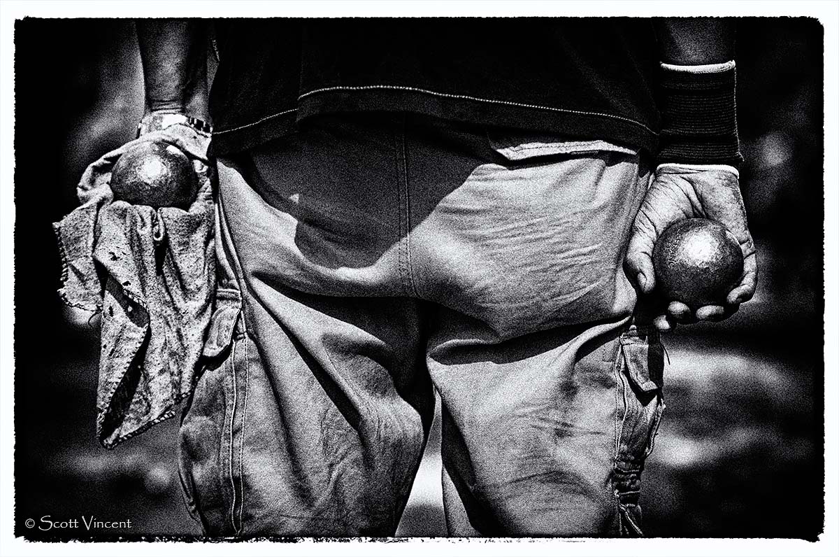
The first photo is an interpretation in a gritty black & white that I particularly like. The photo makes you think for a moment about what is going on. Black & white really simplifies this photo into it’s key elements. The processing is partly the result of using Nik Silver Efex Pro 2 and the “Film Noir 1” preset, with no changes to the preset parameters. Be sure to click on each photo for a larger view.
 Scott Vincent")
Serious Bocce in Black & White (c) Scott Vincent
The second photo is the optimized color version, using targeted saturation and contrast to highlight key areas such as the dusty rag and ruffled pants, and to lower the impact of other areas such as the background.
 Scott Vincent")
Serious Bocce in Color (c) Scott Vincent
For comparison, below is the original photo immediately after the raw conversion and keeping the raw sliders at neutral, i.e. no change. See the difference? That’s how you Make Pictures!
 Scott Vincent")
Serious Bocce – Original photo, straight from the raw capture (c) Scott Vincent
Very nice comparison images Scott! I like the first one best!
Thanks Denise! I’m really liking the first one the best as well 🙂
Great images. I really like the B&W best. Keep up the great work!
Thanks so much Frank!! I’m really happy with how the B&W version turned out!! 🙂
The textures and contrast in the b&w version make it very compelling. I think this would also work very well if the second image were layered on the first with reduced opacity and a mask was applied, leaving the arms, hands, wristband, balls, and rag very lightly tinted in color. That would retain the wonderful texture of the pants while featuring the parts specific to the game. It might also make it easier for people who don’t know the context to understand what’s in the image. (My wife thought it was a bug.)
Hi Dennis, I really appreciate the feedback! And you’re right of course, I created a hybrid of the two and it looks pretty good. I’ll create a new post in a day or two with it!! Although I don’t mind people having to think about a photo for a minute to figure out what it is, a bug is new one!! 🙂 Hope your wife likes the next one better. Thanks again!!